Module #1:
Make A Blogsite
- Browse the page Sign Up And Register For Blog before registering your blog domain.
- WARNING: For security reasons, use a creative blog name rather than your first and last names.
- THINK CAREFULLY: A blog domain name is permanent once it is created. Meaning, it cannot be changed. Ideally, keep your URL domain name short, easy to remember, and suitable to be reused.
- Make a blogsite using edublogs: http://edublogs.org/
- For complete step-by-step instructions to join John Oliver Secondary Graphic Arts class list: http://help.edublogs.org/own-student-blog/
Module #2
Copyright, Public Domain, and Creative Commons
- Go to Canadian Intellectual Property Office
- Read about how to protect your intellectual assets.
- In your own words, use a word document to write a brief summary explaining the 5 intellectual assests in Canada.
- Go to Public Domain website and read the information under the heading, “Public Domain Resources”.
- Choose a public domain resource and upload 3 different public domain assets that best captures something about YOU!
- Place your public domain asset in your word document.
- Go to Creative Commons website and read about the 4 different licensing types.
- Upload the symbol for each, and write a brief sentence explaining what each license type offers.
- Post your fist blog entry by copying and pasting your summary from your word document.
Module #3
Digital Self-Portrait Collage
Key Words:
- Collage
- Balance
- Juxtapose
- Medium
- Two-dimensional
- Low-relief
- Tradition
- Unique
Pre-Collage Questions:
- What makes you unique?
- What are some of your interests/hobbies?
- What is your favorite musician or music group?
- What are your favorite foods?
- What is one activity that you like to do with your family?
- What are your favorite places to go with friends?
- What are some of your strengths?
- Name a person who is important to you? Why?
- Who are your role models? Why?
- Describe one significant event that happened in your life. Why was it important?
- What are some of your family traditions?
- What are some places that are important to you? Why do you like to go there?
Module Requirements:
- Use Photoshop to complete your Self Portrait.
- Set up at 200 resolution and size to one option:
- portrait = 5 inches wide x 7 inches high
- landscape = 7 inches wide x 5 inches high
- square = 6 inches wide x 6 inches high
- Must include at least 8 different images/layers with a Creative Commons or Public Domain license.
- Opacity must be changed on one or more layers.
- Custom Shape Tool must be used somewhere on your page.
- Gradient Tool must be used.
- Your face must be somewhere on your page.
- At least 8 words or a quote must be added that is significant to you.
- Size/Scale Image Manipulation of images used to create interesting compositions.
- Save image in your student folder Graphics>Self Portrait.
- Post your Self Portrait on your blog.
Complete, print, and hand in the Collage Evaluation. See the Collage Evaluation Sample.
Module #4
Image in Box Exercise
- For reference material, check out Tutorials Junction.
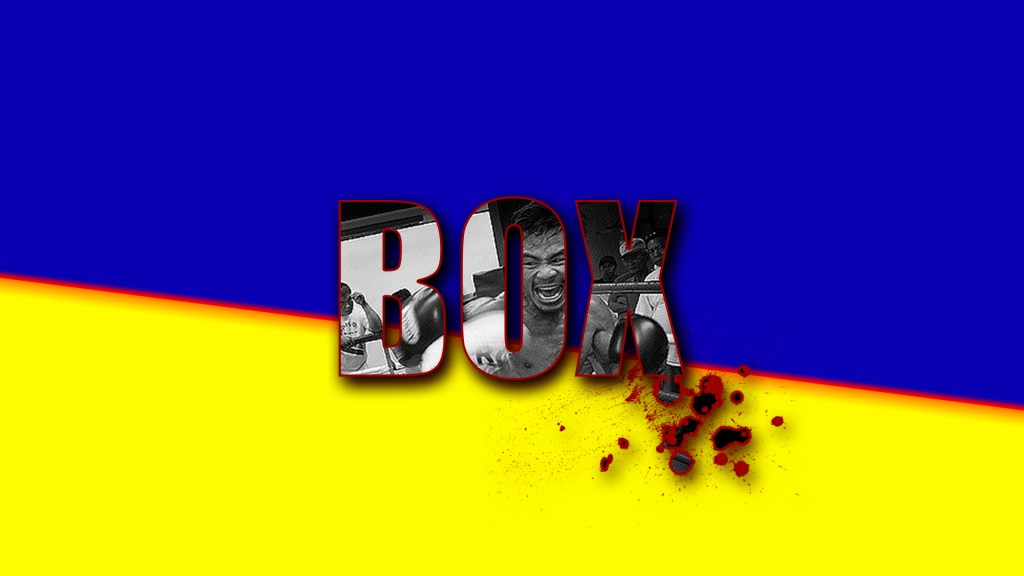
by: Nelson 2016
Module #5
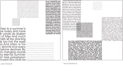
Five Squares, 10 inches Exercise
- Create five justified squares of text, each with its own visual texture.
- Use one of the lorem ipsum generators to create your text.
- Create an Photoshop file, 10 inches by 10 inches. Use a white background.
- Copy and paste each justified text rectangle in separate layers.
- Use different type styles (old style italic serifs, uniformly weighted sans serifs, geometric slab serifs, etc.) for each text block.
- Adjust the typographic colour of each text block.
- Manipulate the scale and placement of the text blocks to achieve a balanced composition.
- Squares can bleed off the edges to reinforce the illusion of amplification and recession.
Module #6
How To Cut Out Anything In Photoshop
Let’s crack on…
Download the building image: S Drive>Handout>Nelson_Graphics>building.

- Use the eraser tool to cut out the sky. Try the square brackets [] to increase and decrease the eraser tool size as you work. Also, try the shift + <> keys to change the brush style.
- Next, use the quick selection tool (shortcut is W) to cut out the blue sky.
- Select: Layer From Background>Colour None>Quick Selection Tool (W)>Delete. The background should be transparent.
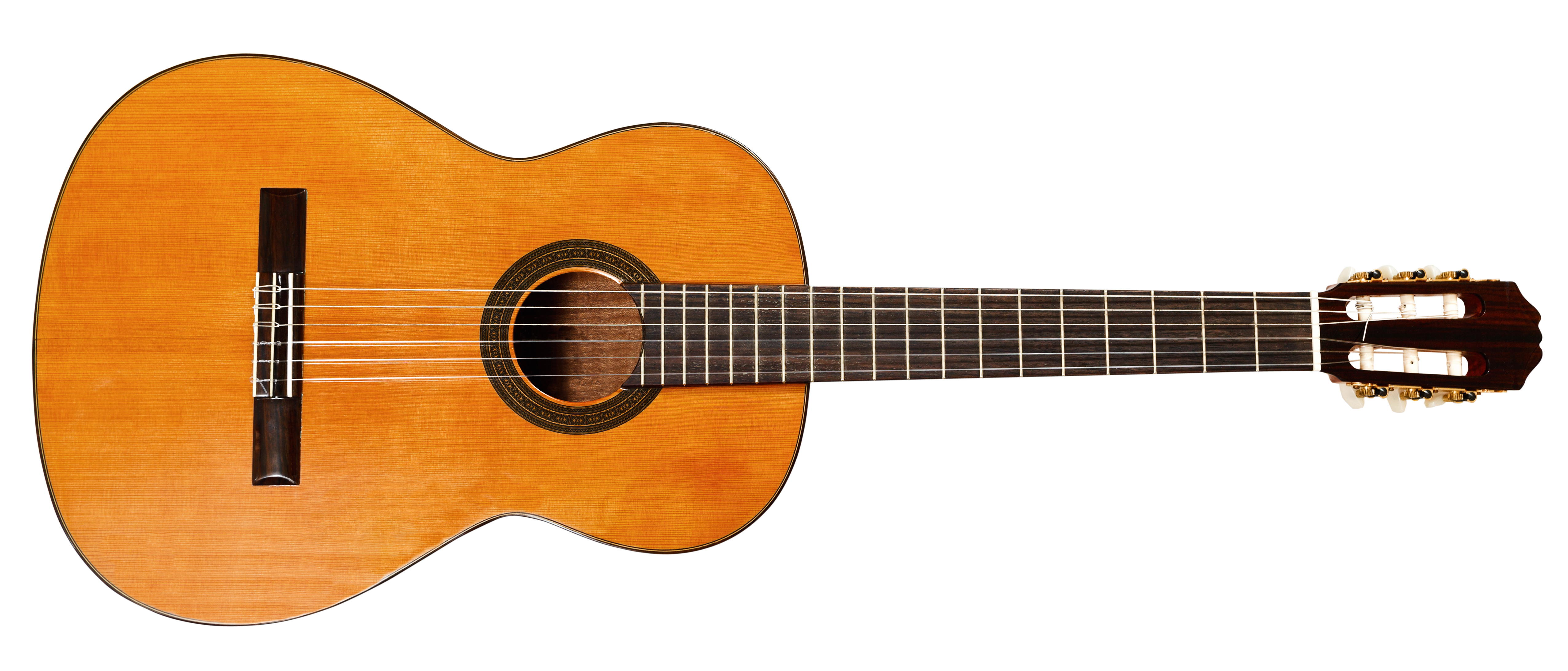
- Watch the video on how to use the Pen Tool by Peachpit TV.
- Use the guitar to first practice using the Pen Tool.
- After you feel confident, use the camper image to cut out the background, using the Pen Tool.

Module #7
Create a poster design using Typography Illustration
This module is inspired by Spoon Graphics. The project is to create a poster design similar to the tutorial example by Chris Spooner.
Watch the clip:
Watch on YouTube: Spoon Graphics How To Create Typography Illustrations the Easy Way with Adobe Illustrator
Set up:
Find an image with a recognizable silhouette.
Fit this image onto your artboard. This means the entire image, not the part you want. This will not affect your final design.
Set opacity of object to 50%.
Go to Object> Lock. This stops you from selecting it by accident as you work.
Select the Pen tool.
Make sure you have this set:
This means you will be drawing only the stroke, or outline, not the fill.
Trace the main outline of your silhouette using the pen tool. Use a method you feel comfortable with.
If your object has any areas inside it that need to be punched out, trace those. Close the path of the shape.
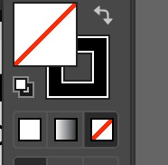
Now you are ready to fill the shape. Select the silhouette and go over here:
Click the arrow to switch the swatch. If you want to change the colour, click the upper left square.
If you have any closed shapes inside the silhouette, you will need to use the transparency tool. See me for details.
Find a song or film quote to illustrate your silhouette. Select a hand drawn looking font to go with your design.
Right click> Select Outlines.
Right click> Ungroup.
Click outside the letters to deselect.
Select each word, Group them together.
Select a fill colour to see your quote.
Select each word and drag it into position on your silhouette.
Scale each to size.
Select first word> Object> Envelope Distort> Mesh. Keep row to 1, and for each letter in your word, use that number for your column.
Now is the fun part. Use Direct Selection Tool (the white arrow) to stretch your fonts to fit your traced image.
Once your words are complete, go to Object>Expand to apply the distortions.
Click the words and silhouette shape, then Object> Compound Path> Make.
Use Pathfinder> Minus Front.
Select everything, right click, Group.
Go to Effect> Distort & Transform> Roughen. In the options button, select Absolute, Size 0.5 px, Detail 20, and Smooth. Click OK.
Congratulations, you completed the first of two parts in this module.
Next up… Creating a texture and print your design.